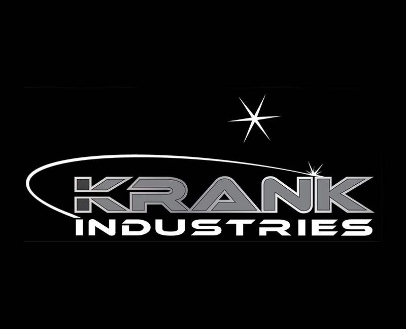
One and the same
Typically, you couldn’t get two trades quite so unrelated; yet the unique combination of the dissimilar, make for an exceptional business proposition and is sure to guarantee on-going work. Sheet Metal, Boiler-making, Carpentry and Concreting each require a strong skill-set, professionalism and attention-to-detail; yet Krank Industries have managed to associate all of these careers into a unique and specialised operation.

Create a logo for a business specialising in two distinct trades
- Client
- Krank Industries
- Industry
- Industrial & Construction
- Services
- Design
- About Project
- During the initial investigation stage pre-finalisation, our client liked the developing concept so much that a new partnership was created within the construction sector. This new alliance meant that the typography and style of the logo had to cross two sectors.
- Project Brief
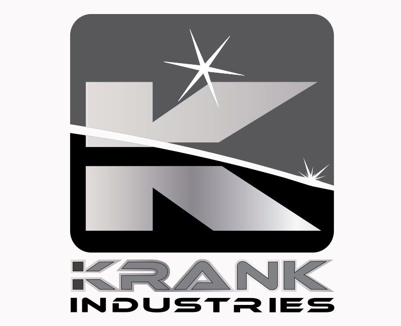
- The initial task in hand was to design a logo from concept to finished art that would be suitable for an established welding and fabrication practice.

Based upon the knowledge that a distinct design had to be created to marry two trades together, we felt that it was important for the overall design to illustrate manufacturing and engineering.
For this reason, our font of choice was Ethnocentric because of its obvious industrial connotations.
We decided to reveal the two trades by creating a separation on the first letter of the logo which emphasises a divided description. An obvious outline around the whole name cements the two identities.
Elements of an arc and flare encircling the design were used to represent the primary skill-set.
The diversity that can be applied to this logo in various scenarios as a full colour logo, black and white or half logo without the elements is unique.

- krank industries
LOGO DESIGN + BRANDING & IDENTITY
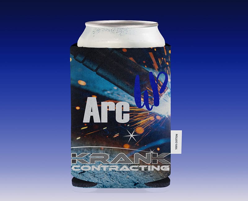 Merchandise1
BRANDING & IDENTITY
 Merchandise2
BRANDING & IDENTITY
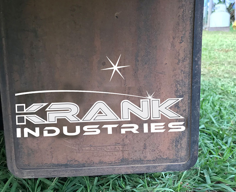 Krank Identity and Branding
- Krank-brand flyer1
 Krank-badge
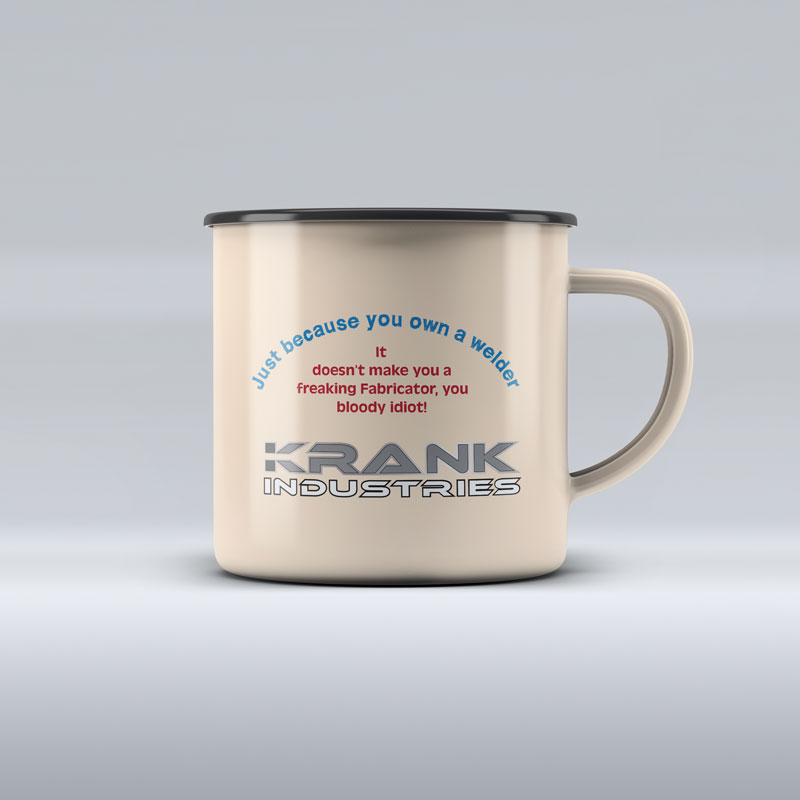 Krank-enamel mug
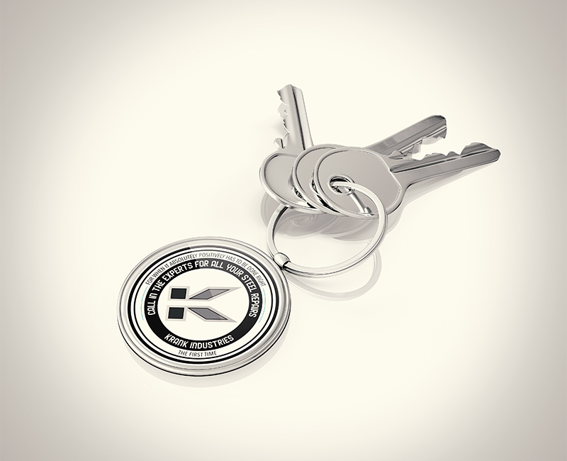 Krank-keyring
BRANDING & IDENTITY + DESIGN
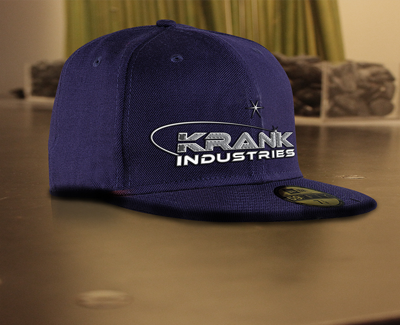 Krank-cap
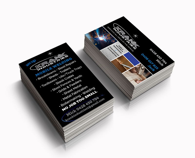 Krank-business cards
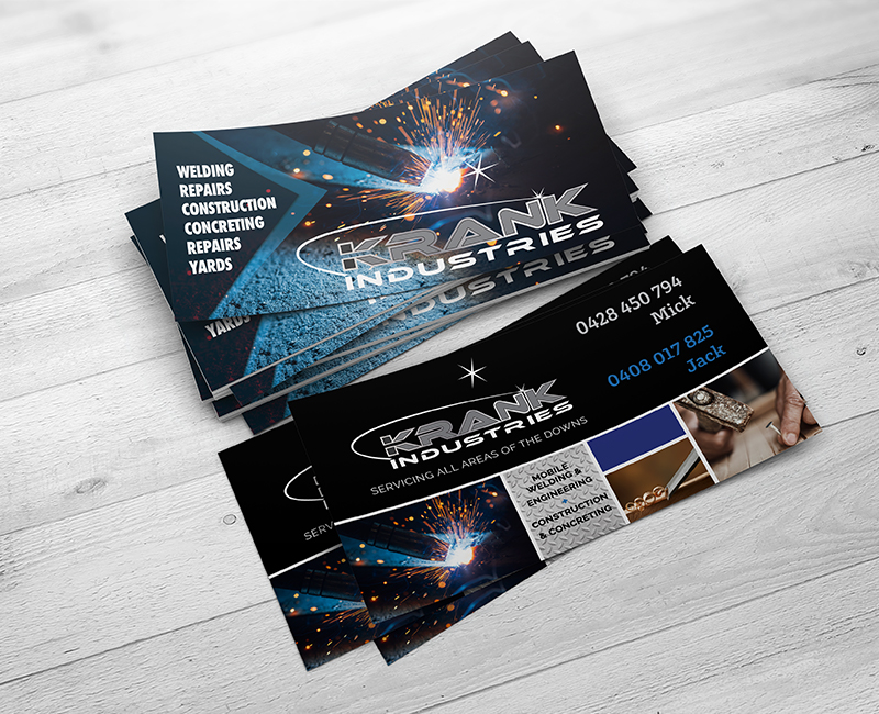 Krank-DL
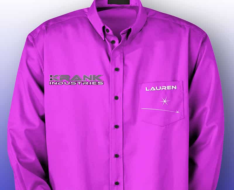
 Krank-Dress shirt
 Krank-invoice
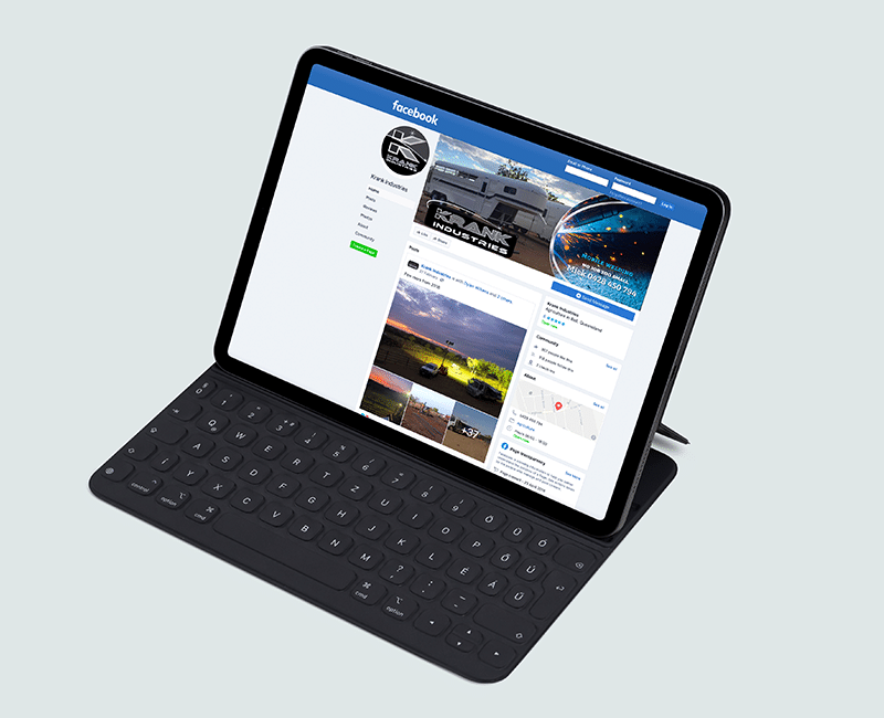 facebook cover
Social Media