Black and white is never boring
Don’t for a minute assume that black and white in print is dull, boring, antiquated and plain old-fashioned! Not on this project though. It’s alive. Black and white is so not on trend. But we feel that you can do so much with b&w and it’s oh-so exciting to work with.
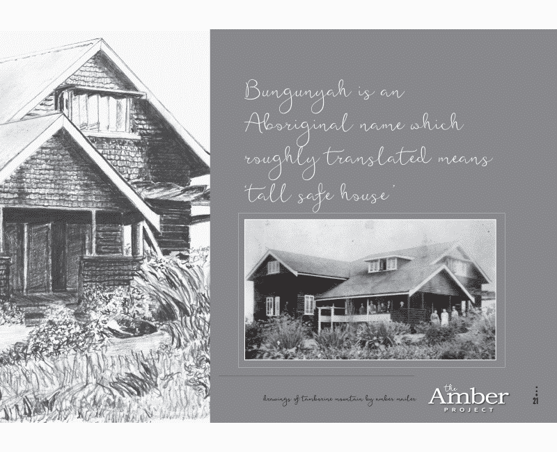
Typically when you think black and white interiors, you would naturally assume the pages would be white with black text. To mix it up a little and create a sense of excitement we decided to use grey to provide colour. With a solid grey background and contrast in the text, the pages came alive with colour. And technically at 55% black, we were well within the brief.
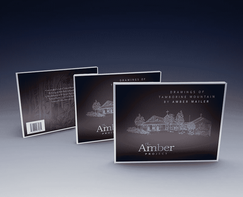
 by Amber Mailer")
Design and layout of cover and interior pages of book
- Collaboration of Clients
- St George's Anglican Church,
- Tamborine Mountain Historical Society
- Tamborine Mountain Arts Collective
- Industry
- Arts and History; Australian Poetry; Drawings-Queensland-Tamborine Mountain; Historic Buildings-Queensland-Tamborine Mountain; Tamborine Mountain-History
- Services
- Design
- About Project
- The only criteria for this project was to layout the book in an aesthetically pleasing style based on the fact that it had to appeal to a diverse audience, showcasing the beautiful drawings of Tamborine Mountain by Amber Mailer. Its presentation should be creative. Featuring Tamborine in all it's glory encompassing drawings, poetry and local history, it was hoped that the book would appeal to a broad audience.
- Project Brief
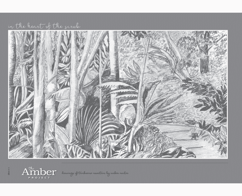
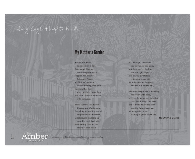
- In keeping with the artworks (which were all done originally as pencil sketches) it was important that the interior also be presented in a black and white format.

We chose to create a logo for the title that could be used on every page throughout the book, subtly supporting the creative elements while respecting the artist and her work.
Almost eclectic as you flick through the book; it is intentionally set out to inform, educate and feed curiosity. The tone of the book balances information, poetry and drawings in a light ambience and does not come across as heavy reading material.